Blix is an app for bookmarking places. Other mapping apps often point to entrances and arbitrary geographical centers—Blix lets users save and share precise locations. I worked with Blix to design a mobile app, identity, brochure website, and several prototypes for a future desktop version of the app.
Visual, Brand, Product
2015
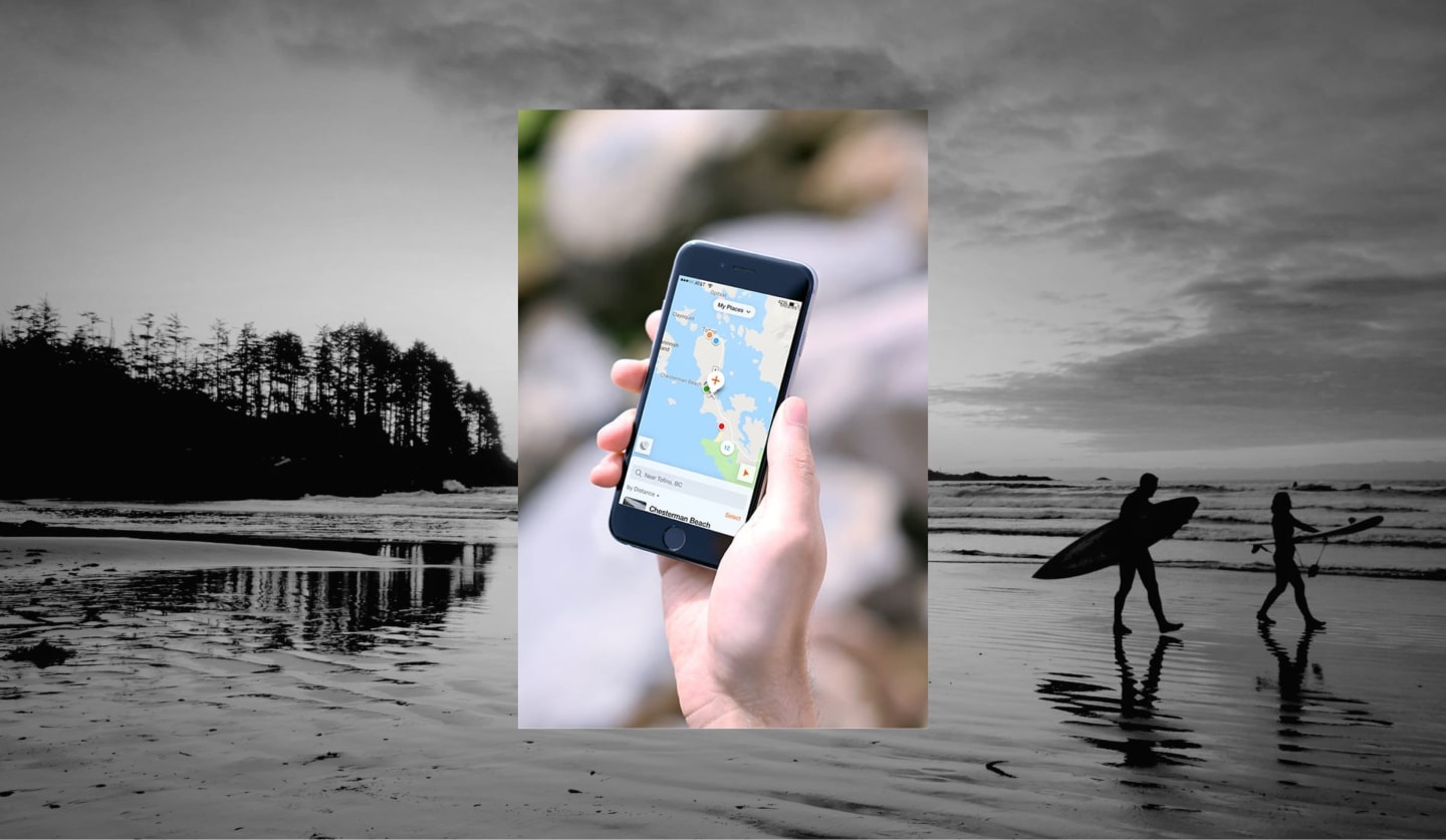
Blix is for when the place worth remembering isn’t just a park, but is the exact spot on your favorite beach with the best breaks.
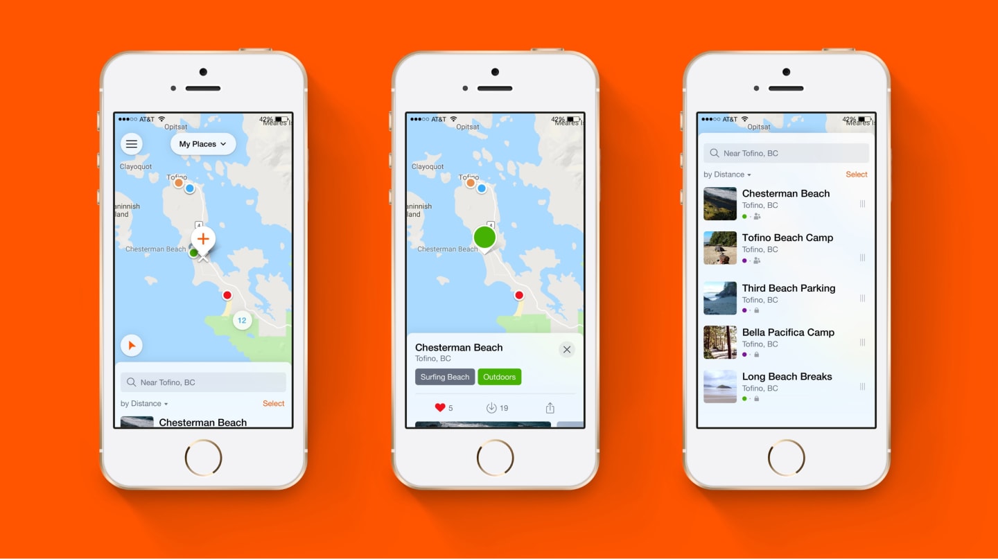
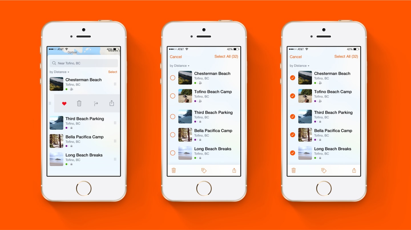
The map is at the center of the app. From here, users can see nearby locations or swipe up to see a searchable and sortable list.
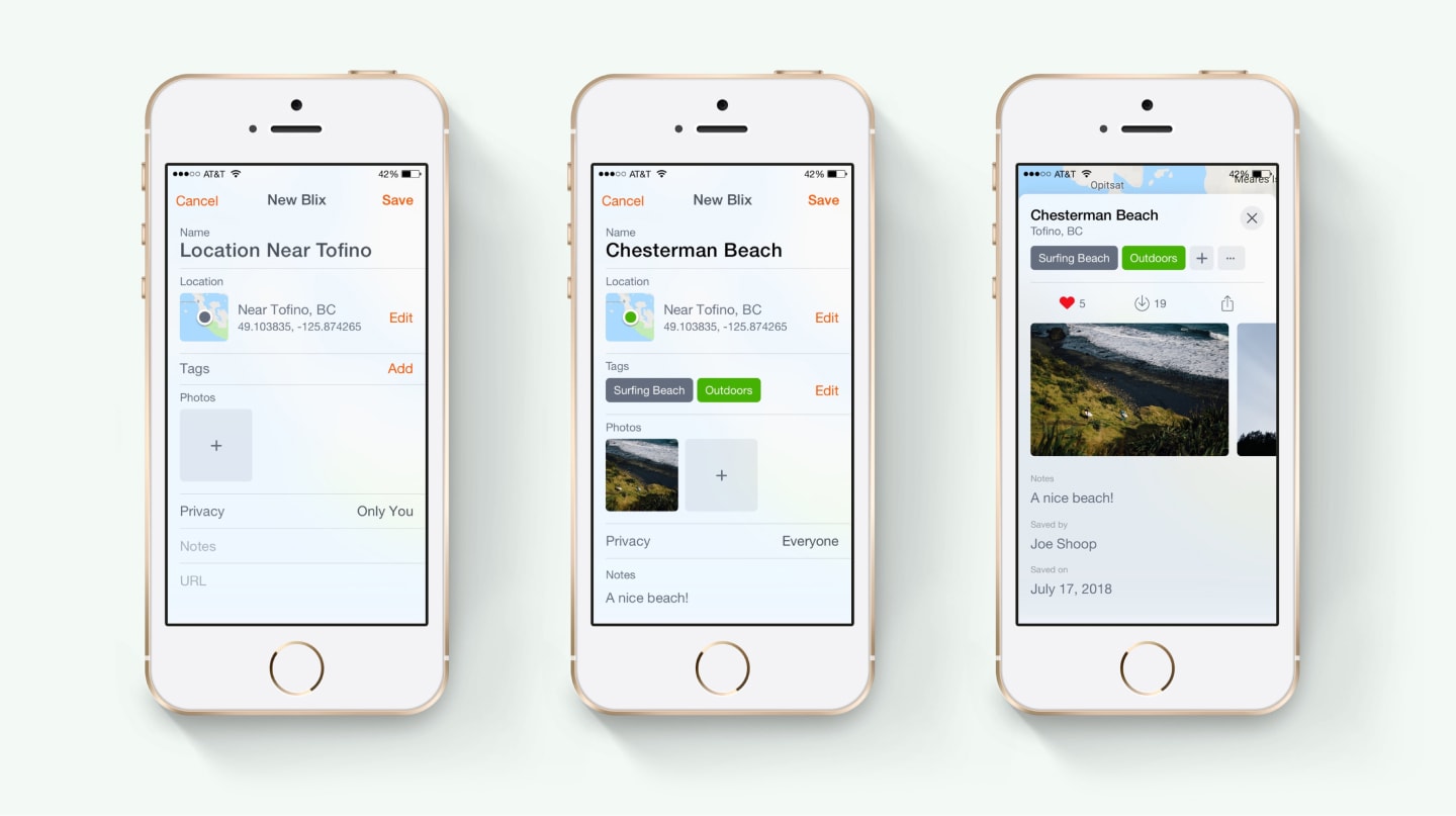
Saving locations is the central feature of the app, so we put it front and center. Move the map around and the ‘New Blix’ pin floats in the middle of the screen, marking the spot a new Blix will be created when the button is tapped.
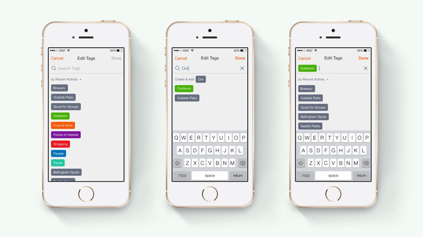
While creating or editing a Blix, users can add custom tags for easy retrieval later. Add from a sorted list of existing tags, or start typing to search or create new tags.
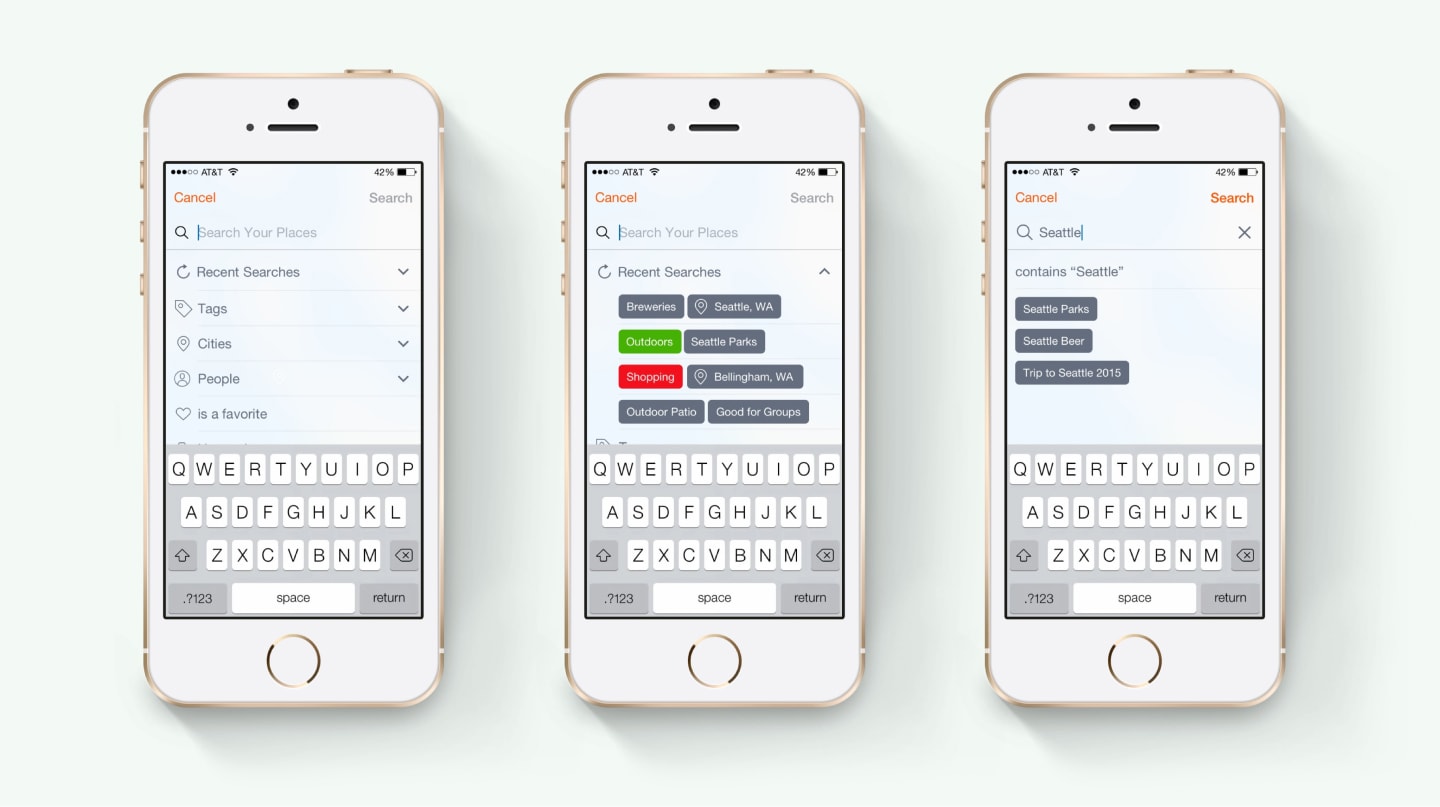
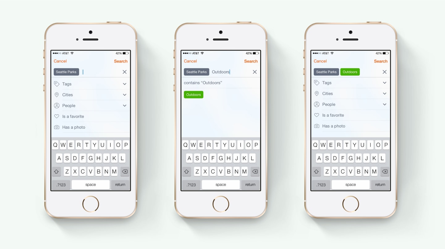
Search by keyword, city, tags, and more.
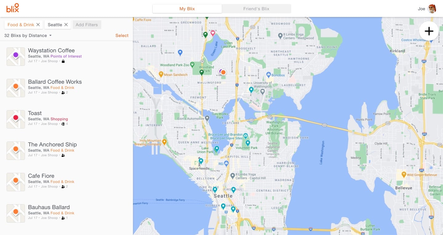
While the initial design work for the app was wrapping up, we started thinking about how Blix might later scale up to bigger screens, and I built an html prototype to help visualize this exploration.
The New Blix pin and X from the map view are reinforced in the logo and app icon.

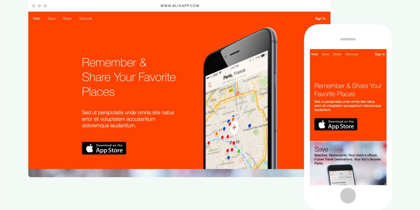
A basic one-page website to promote the app and direct people to the appropriate app stores.
