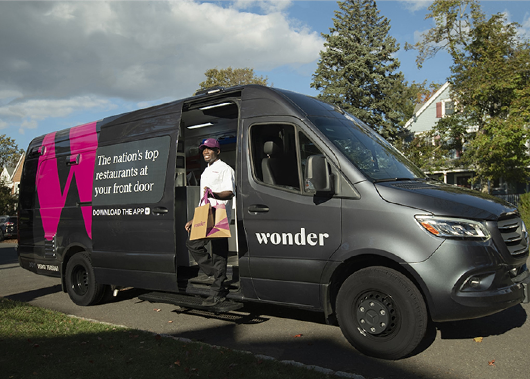
Wonder delivers restaurant-quality food directly from a mobile kitchen where each dish is fired and plated steps away from customer's doors. I worked with Wonder and Formidable to design an app that helps Drivers navigate throughout their shift.
Product
2022

Ben is a driver and chef for Wonder. His kitchen is inside the back of a Sprinter van. He does it all—drives, cooks, and delivers food straight to customer’s doors.

Drivers at Wonder go directly from customer to customer, avoiding the cross-town detours inherent to typical restaurant delivery.
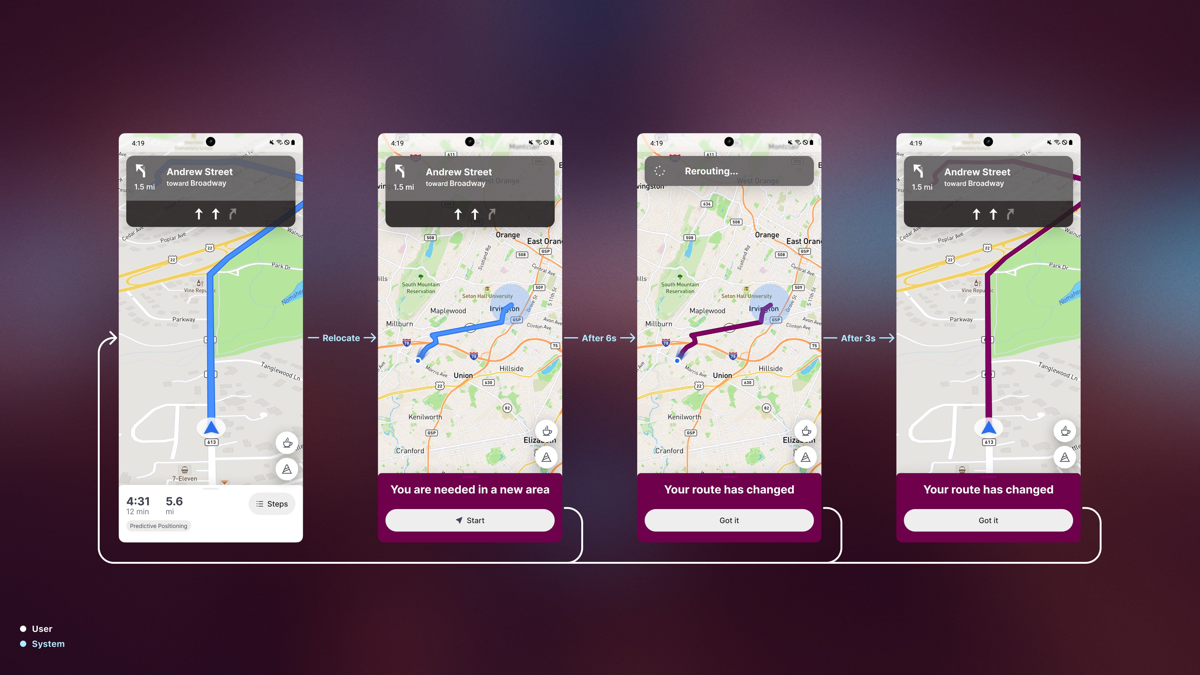
This makes Wonder more nimble than other delivery networks. Less time is spent driving and most orders are delivered in under 10 minutes. To take advantage of this agility, the team built a feature to reposition drivers closer to potential customers, resulting in even quicker delivery times.
Relocate while parked
Relocate while driving
The app is the primary source of direction for Drivers, but it should not be a distraction. No interaction is required to continue along the correct route while driving.


In weekly conversations with Drivers and their support team, there was consistently a lot of really great first-hand feedback.
Early on, Drivers were using Slack to get help and request breaks. This type of freeform communication didn’t scale well, and eventually became a huge bottleneck.
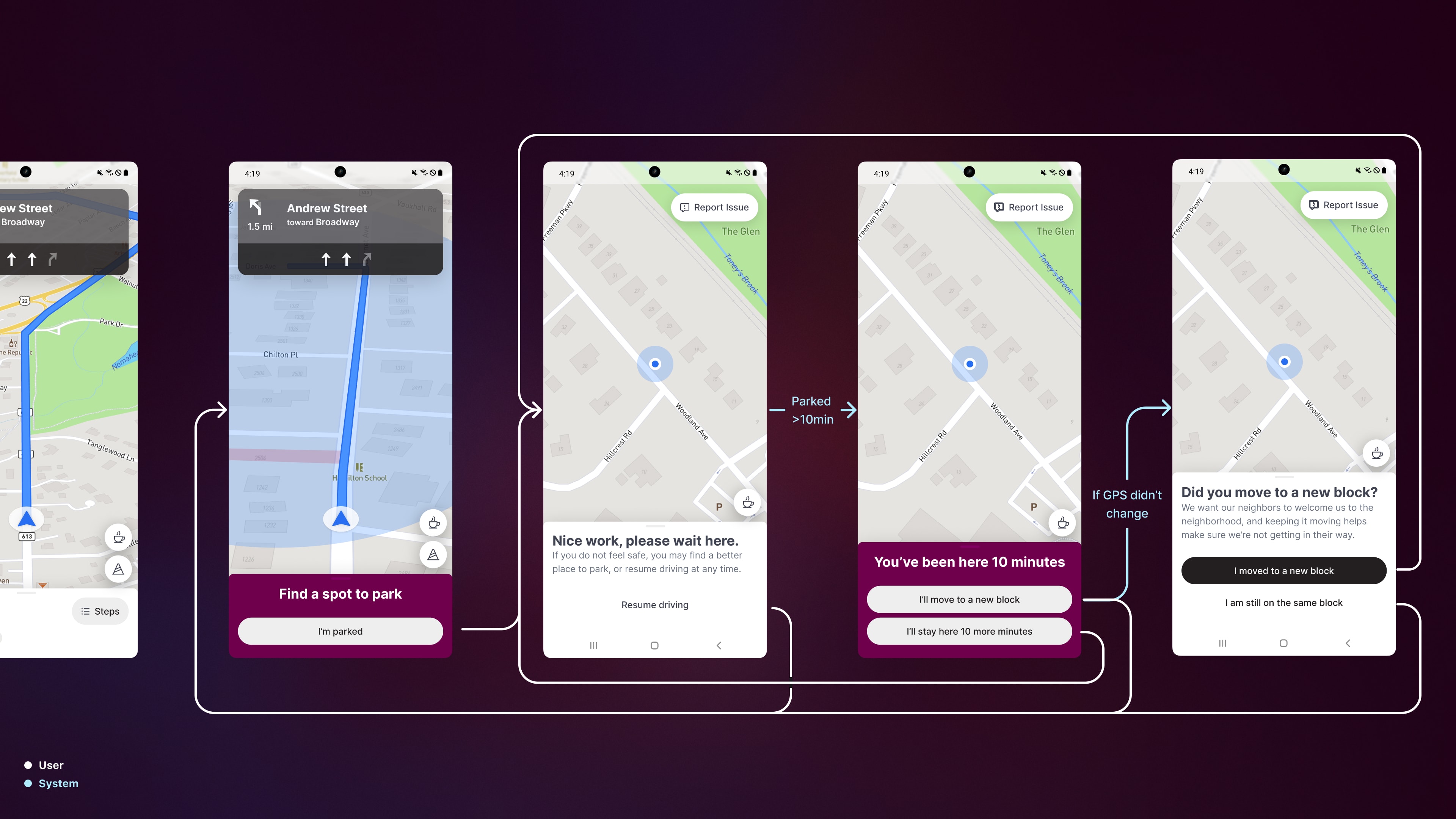
Through those weekly conversations with Drivers, the product team enabled them to quickly request breaks, report any issues, and get some immediate feedback on what to do next without leaving the app or waiting for a reply when they need help.
Report while parked
Report while driving
Request break
Drivers could request breaks, but the app didn't offer much choice in where to take the break. In a weekly feedback session, they talked about often needing to leave the app to find a place with amenities.
We added known break locations to the route preview map so Drivers have some choice in when and where to take their break.


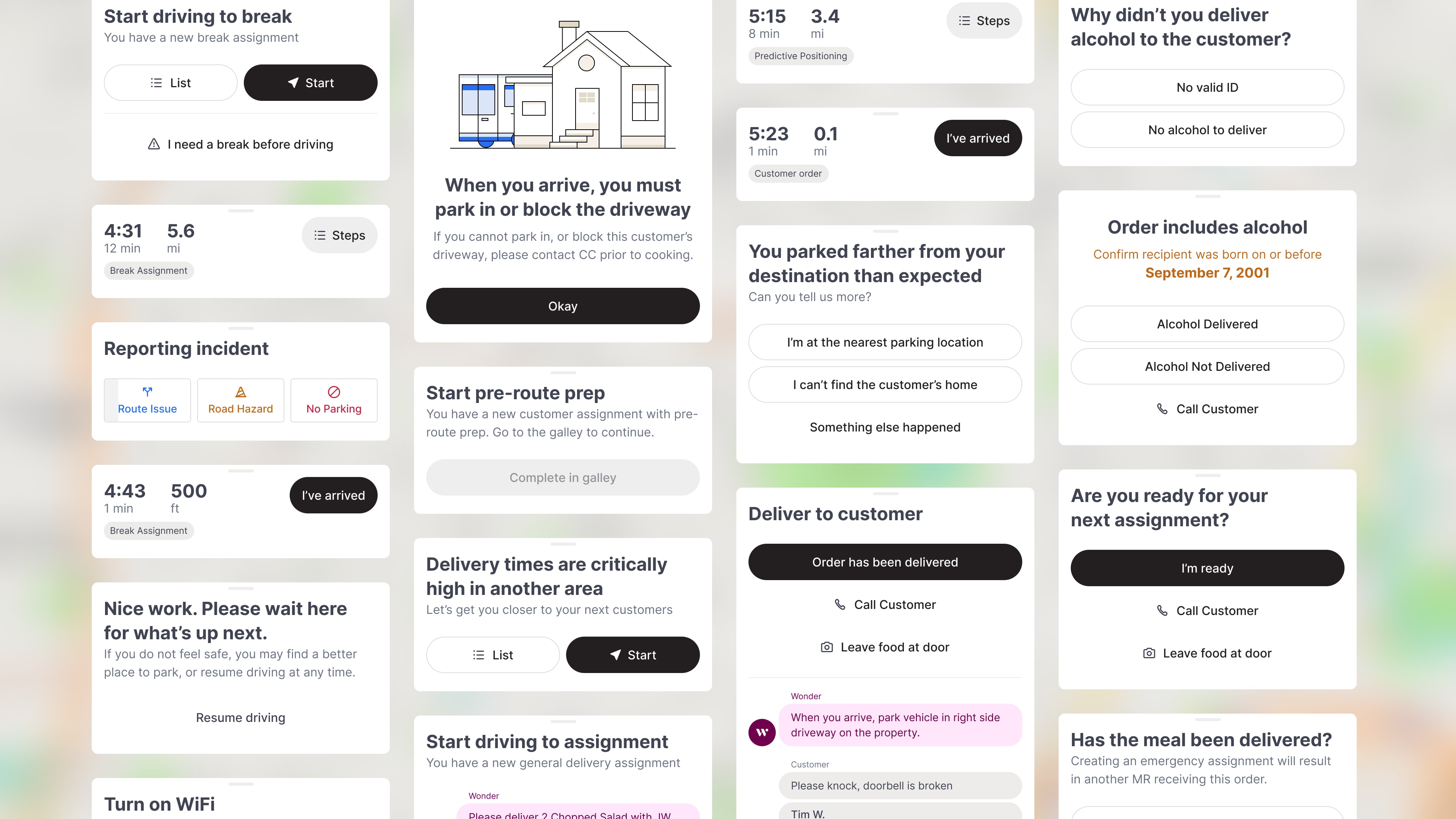
The app generally acts as a conversational dialog, presenting a series of choices and instructions throughout the shift.
Every moment in the shift has variable circumstances, so there are many combinations of the sets of actions that are available at any given point.
With a small set of components, the app can support every one of these variations with a flexible bottom sheet.


Also available in dark mode
This powerful Figma component helps bring consistency and speed to the design process. Every single screen throughout the app uses this one bottom sheet component, perfectly aligned with the dev team’s approach to component architecture.
Credits
-
Abbey Rom
Product Manager
-
Mike Coetzee
Design Lead
-
Joe Shoop
Product Design
-
Ilya Gazman
Engineering Lead